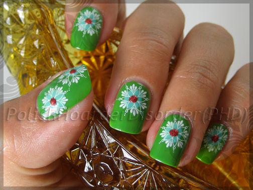
Here was my entry for my vintage nail design challenge:

Base Color- OPI "Greenwich Village"
Teal Dot- China Glaze "For Audrey"
Flower- Konad Plate M20 (in White Special Polish)
Red Dot- Stripe Rite (Red Glitter)
I never know when enough is enough. I'm glad I took photos of my nails before I added the red dots because I think I like them better that way.


I really wanted to use all 4 colors though...
Such a lovely design!
ReplyDeletevery pretty... and crisp!
ReplyDeleteI like this both with and without the red dot. It loos gorgeous :)
ReplyDeleteBeautiful, so crisp, and I love the color combo
ReplyDeleteI adore this design both ways! And your nail shape is so perfect, I really enjoy looking at your nails =)
ReplyDeleteI agree, perfect nail shape (as said in my mail ;) ).
ReplyDeleteThe design is so nice, I really like the stamping - it's very clear.
Why topcoat do you use over stampings - you surely know some are smearing =/
Love this mani - before you added the red dots. =)
ReplyDeleteOMG! Stunning! :)
ReplyDeleteI REALLY like this!
ReplyDeleteCali369- Thank you!
ReplyDeleteTennsley- Thanks :) It was very simple and easy to do!
Stephanie- I like it best without the red dots. There is more emphasis on the flower that way! Thanks for stopping by!
Dollface- Thank you :) I'm very picky when I stamp! If it doesn't look perfect on the stamper then I don't put it on my nail! Also, I make sure I use a good amount of the Konad top coat so I don't drag my design!
Trincess- Thanks! I've been trying shape my nails better lately! I'm glad someone likes them!! :)
Peripatetic33- Thank you!
LaLadyBunny- Thank you! I use Konad top coat when I stamp. I use a fair amount of it on my nails so it doesn't smear. If you don't use enough, it will drag your design like other top coats do...
April- Thanks :)
Nihrida- Thank you! Me too! The more I look at the picture with the red dot, the more I hate it!
Tassa- Thanks!! It seems too simple to be stunning though, to me anyways! :)
ABOP- Thanks :) And thanks for commenting!
I like both versions! And too think you were inspired by china!
ReplyDeleteBoth versions are fabulous in their own way. :)
ReplyDeleteAww thanks Starlight & Lacquer Ware!
ReplyDeletethose are awesome, they really do remind me of vintage kitchenware.
ReplyDeleteThanks Jeannie! :)
ReplyDeleteSo inspiring :D
ReplyDelete